Imagine you're a decision-maker at a fast-paced company, constantly on the move. You need to make critical choices based on real-time data, but your tools are tethered to a desktop.
What if you could ask questions to an AI, right from your phone, and get instant, actionable insights wherever you are?
That was the vision behind this project.
Product
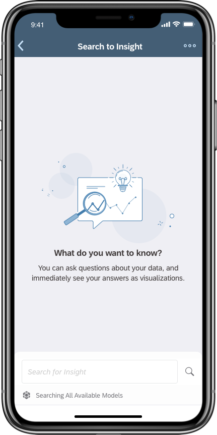
‘Search to Insight’ is a self-service analytics product that enables decision-makers answer critical business questions immediately.
Project
I designed and shipped an AI-powered product for the SAP Analytics Cloud iOS app, which received a 4.8-star rating and positive feedback from users. I was responsible for the end-to-end UX and UI design process and conducted user research.
- UX Design
- UI Design
- User Research
- Sketch
- inVision Studio
- Zeplin
Process
Intro
SAP. Analytics Cloud is a business intelligence platform where decision-makers access self-service analytics to get insights from their data through visualizations. When I joined, a new AI feature called SAP Search to Insight was available on the web app, and my task was to bring it to mobile.
I was part of the mobile team and SAC's global UX team, which had 60 designers in 2019. I was responsible for the end-to-end UX and UI design process and conducted user research. The result was a new feature on the SAC iOS app, which received a 4.8-star rating and positive feedback.
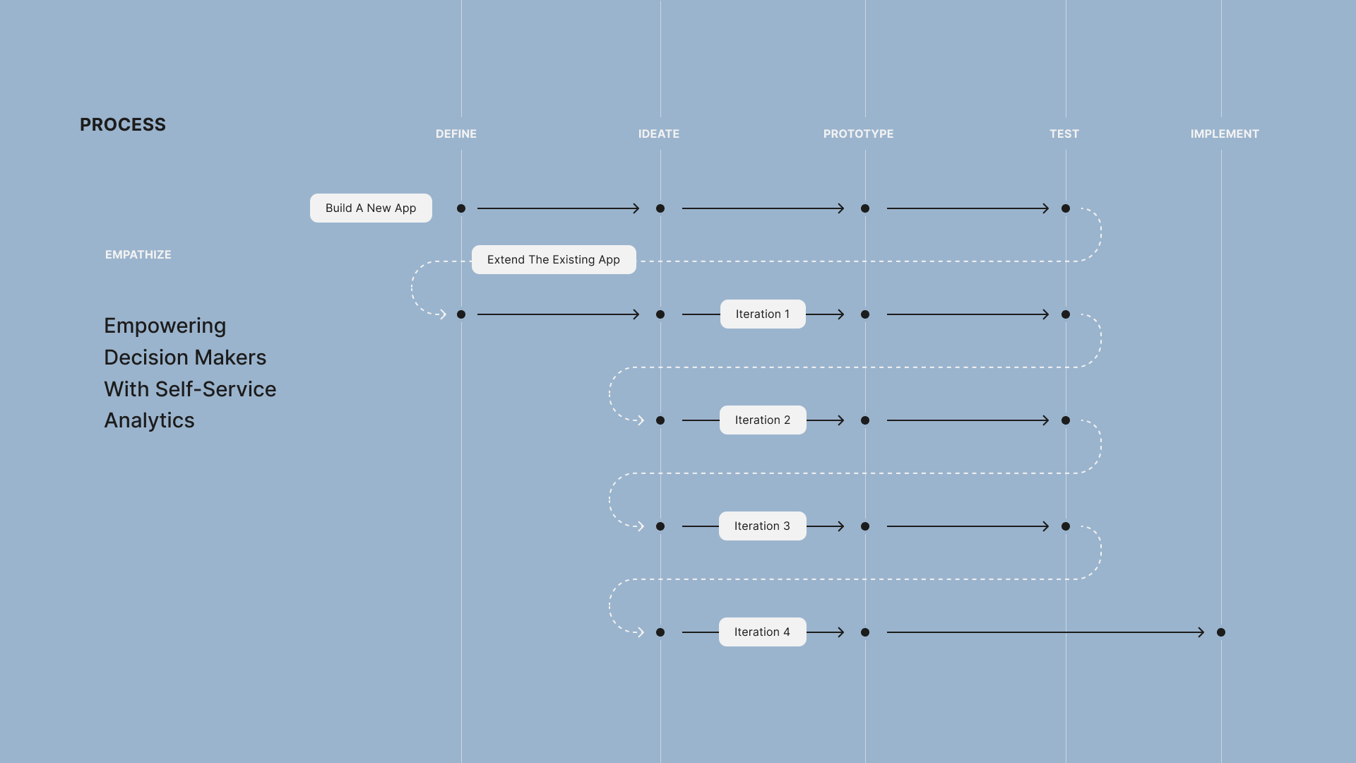
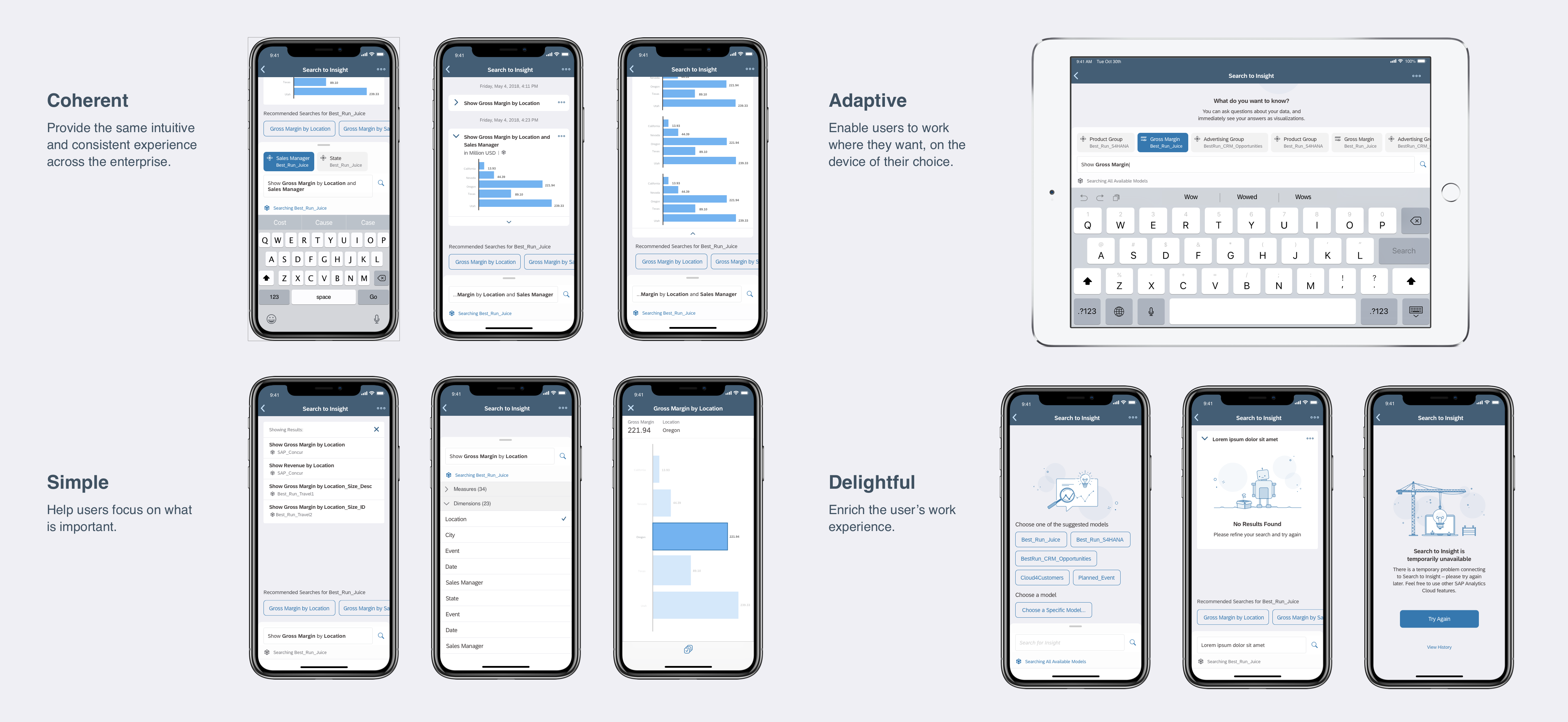
Before diving into the case study, I want to give you an overview of the design process and emphasize its nonlinear nature. For this project, the team aimed to combine all AI features into a new application called Insight. The initial design phase focused on integrating these capabilities into one app. I was in charge of ideation, prototyping, and pitching it to stakeholders. The team decided to shift focus to extending the existing app instead of creating a new one. I then took the design through four iterations, each followed by usability testing. Finally, the fourth iteration was implemented and shipped to the app store.
Challenges
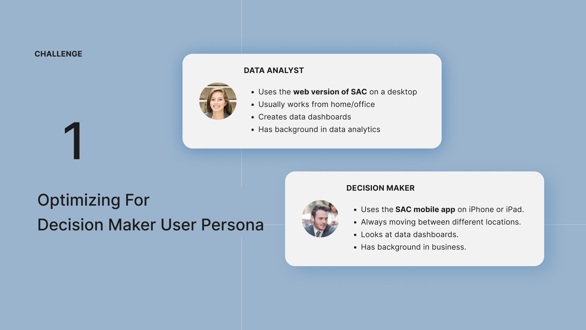
There were two design challenges. The web app, with its many features, was mainly used by data analysts and covered more complex use cases. We needed to optimize the design for decision maker user persona by making sure the features are simple and easy to use.
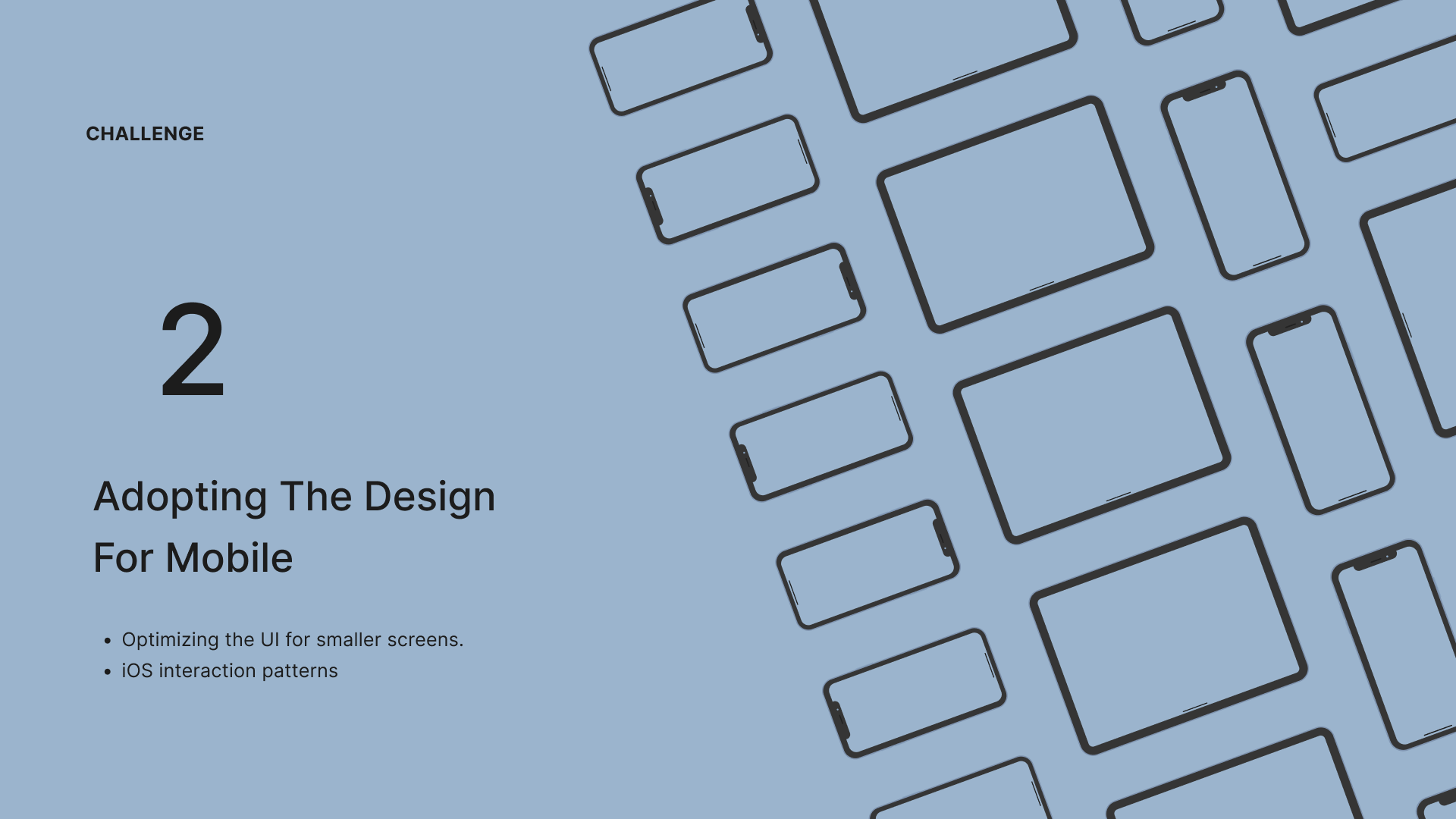
Another challenge was adapting the design for mobile, ensuring it worked well on smaller screens and using unique iOS interaction patterns.
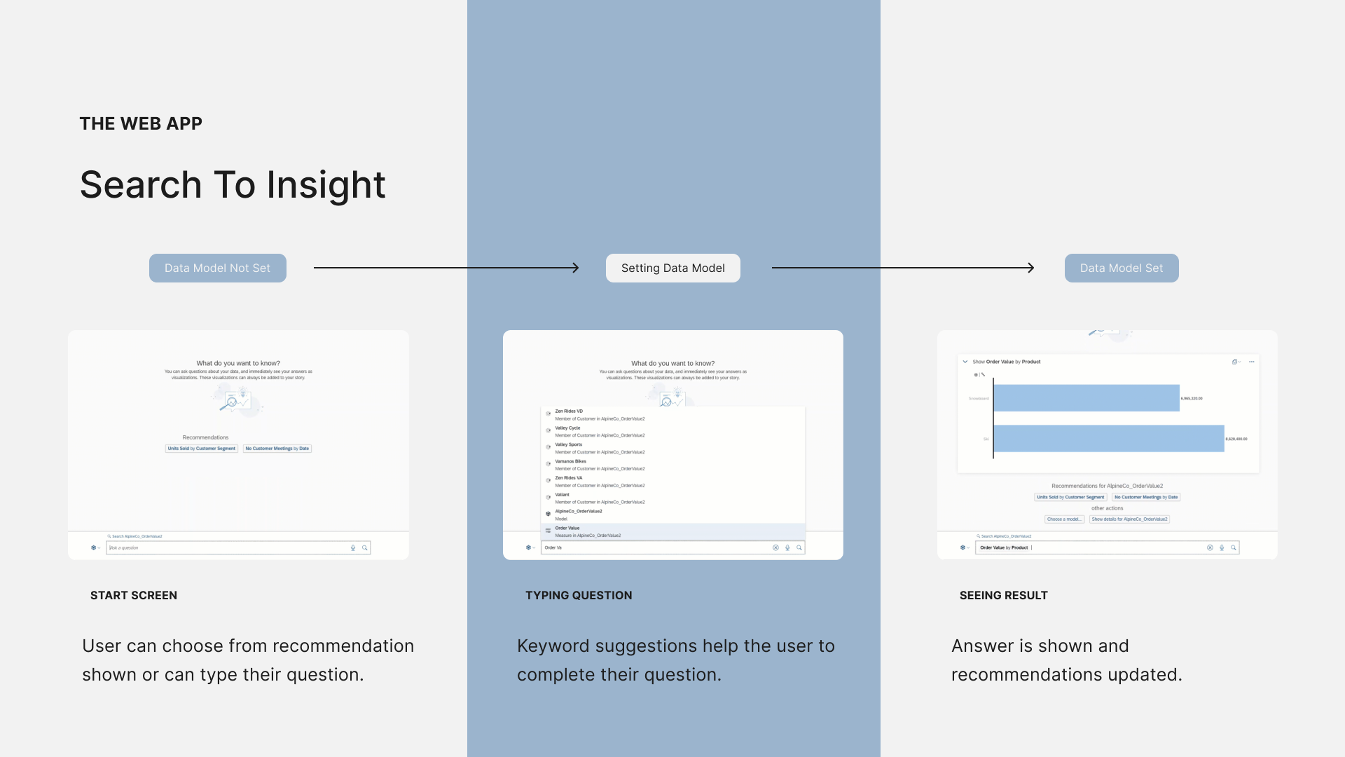
The Web App
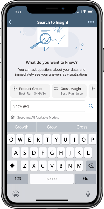
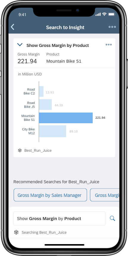
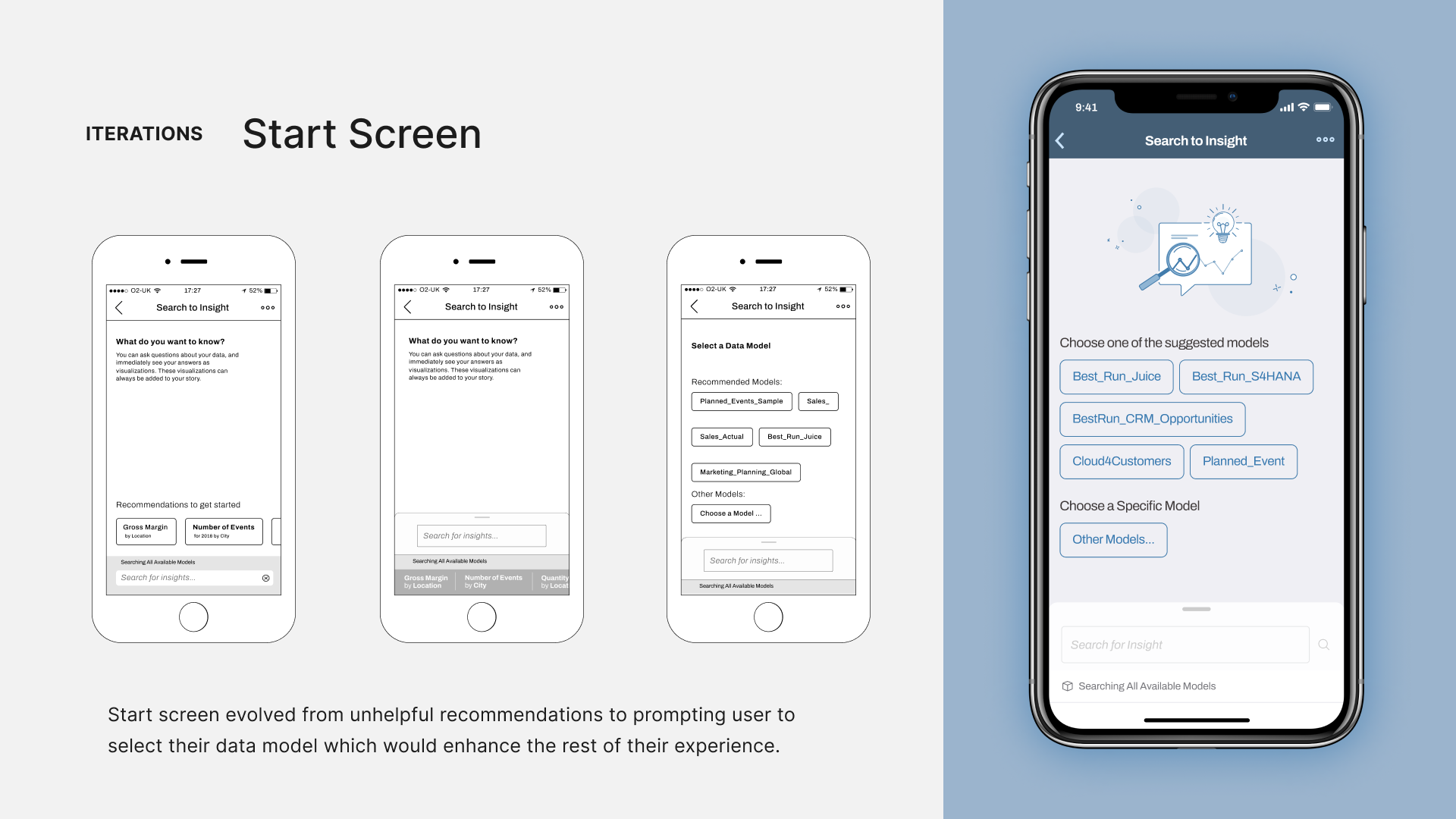
Let's take a look at the web app. There were three key moments in the interaction with search to insight. First, the start screen where the user chooses from recommendations. At this point, the data model is not set. When the user starts typing their question on the second screen, they see a list of suggestions from various data models. It's crucial to choose the right suggestions as they determine the data model context for the whole experience. Finally, the screen displaying the result shows the answer and updated recommendations based on the chosen data model.
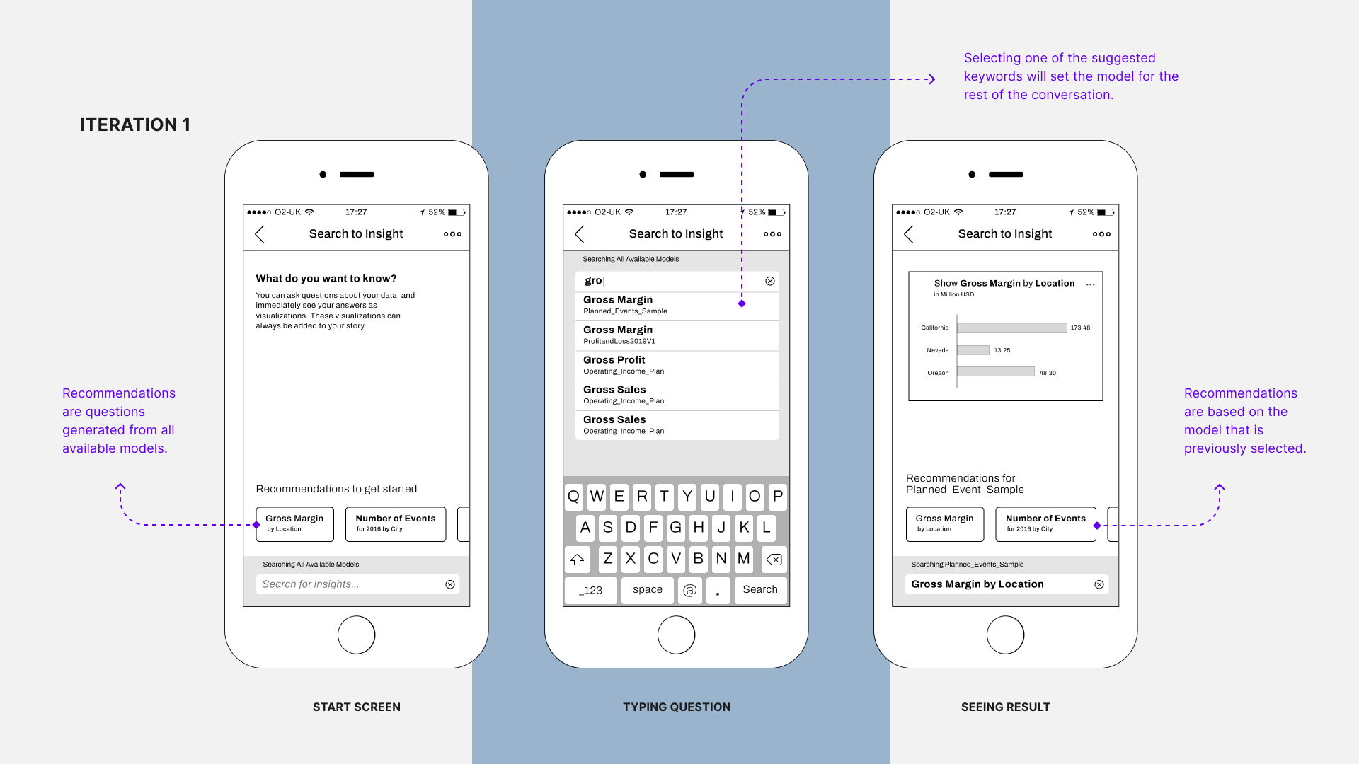
1st Iteration
My first iteration was very similar to what we see on the web: recommendations, keyword suggestions, search results, and recommendations based on a specific data model. I used some mobile patterns like the list of suggestions, which is common in web search apps, and overall it stayed true to the web experience.
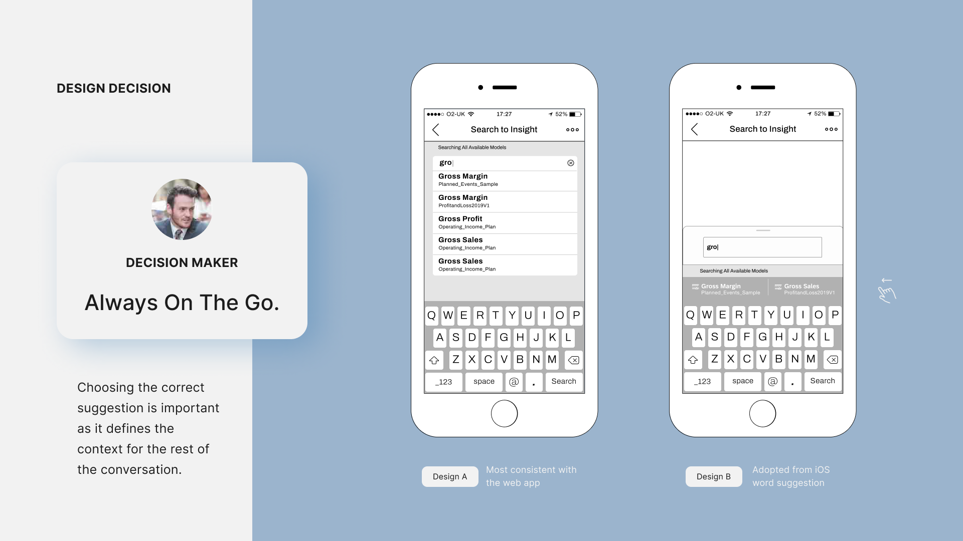
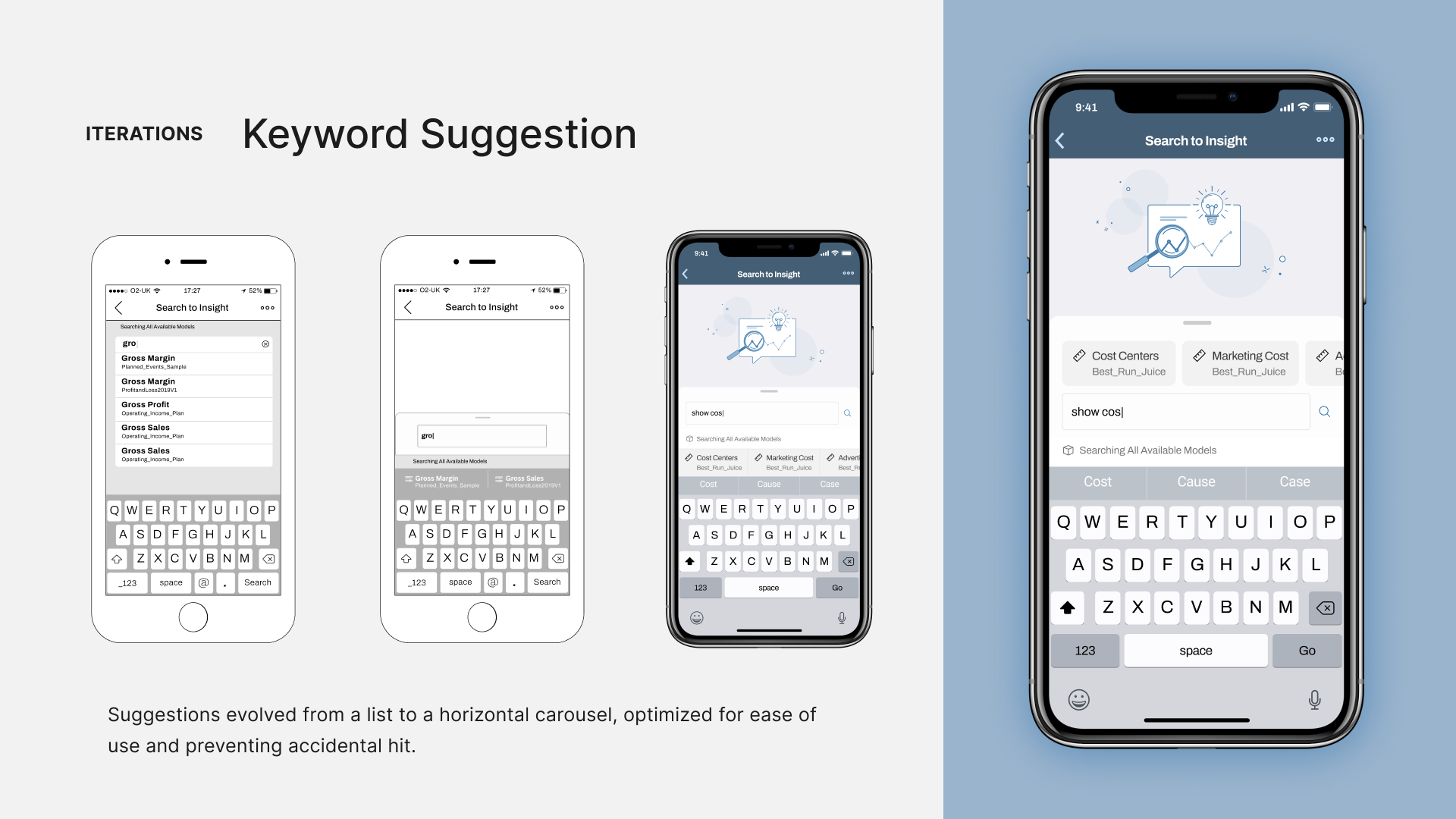
Returning to our first challenge, I wanted to thoroughly explore the best interactions for our decision-maker persona, who is always on the go. Since choosing from suggestions was the key interaction, I tested another variation where suggestions are displayed horizontally, allowing the user to swipe left and right to scroll. This design, inspired by iOS keyword suggestions, could simplify interactions and reduce mistakes.
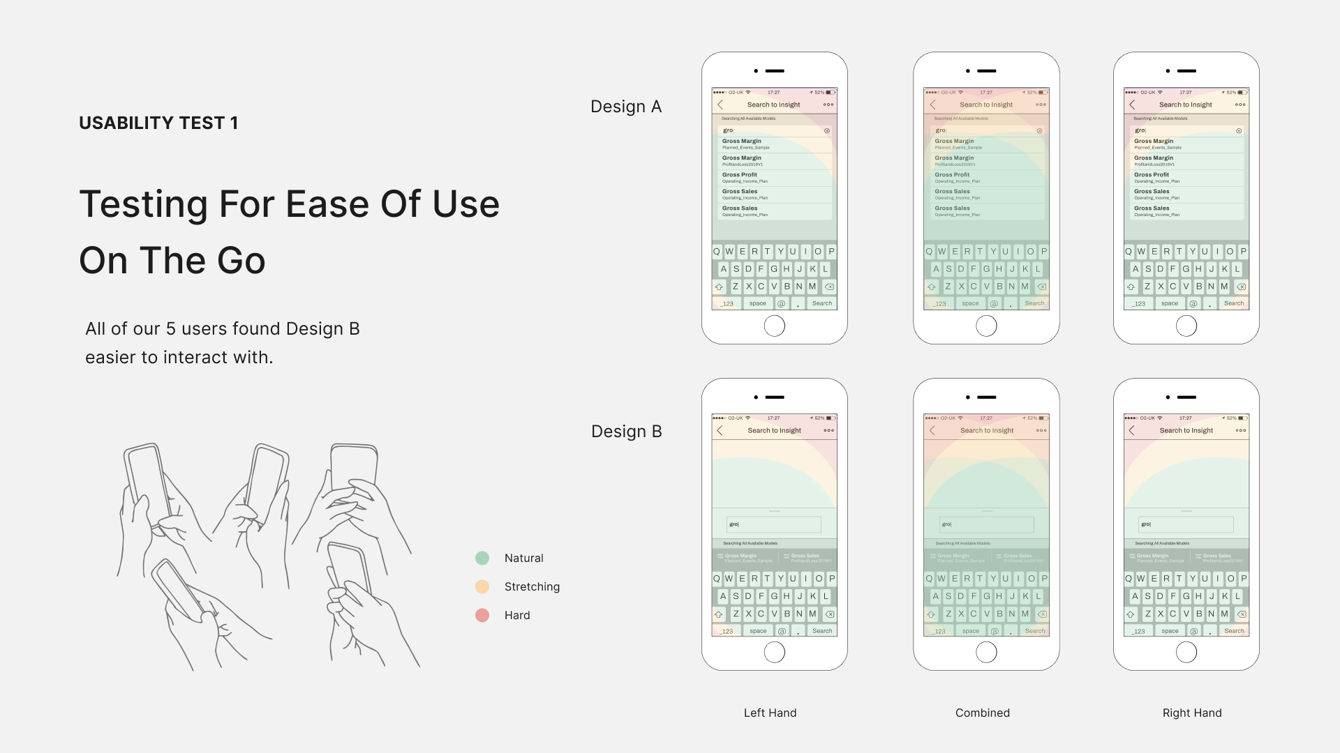
Usability Test 1
I created two interactive prototypes using Invision and tested them on an iPhone with five participants. Almost everyone preferred the second design because it felt more natural to interact with due to the placement of the suggestions, which they were already familiar with in iOS. Keeping that in mind, I moved to the second iteration.
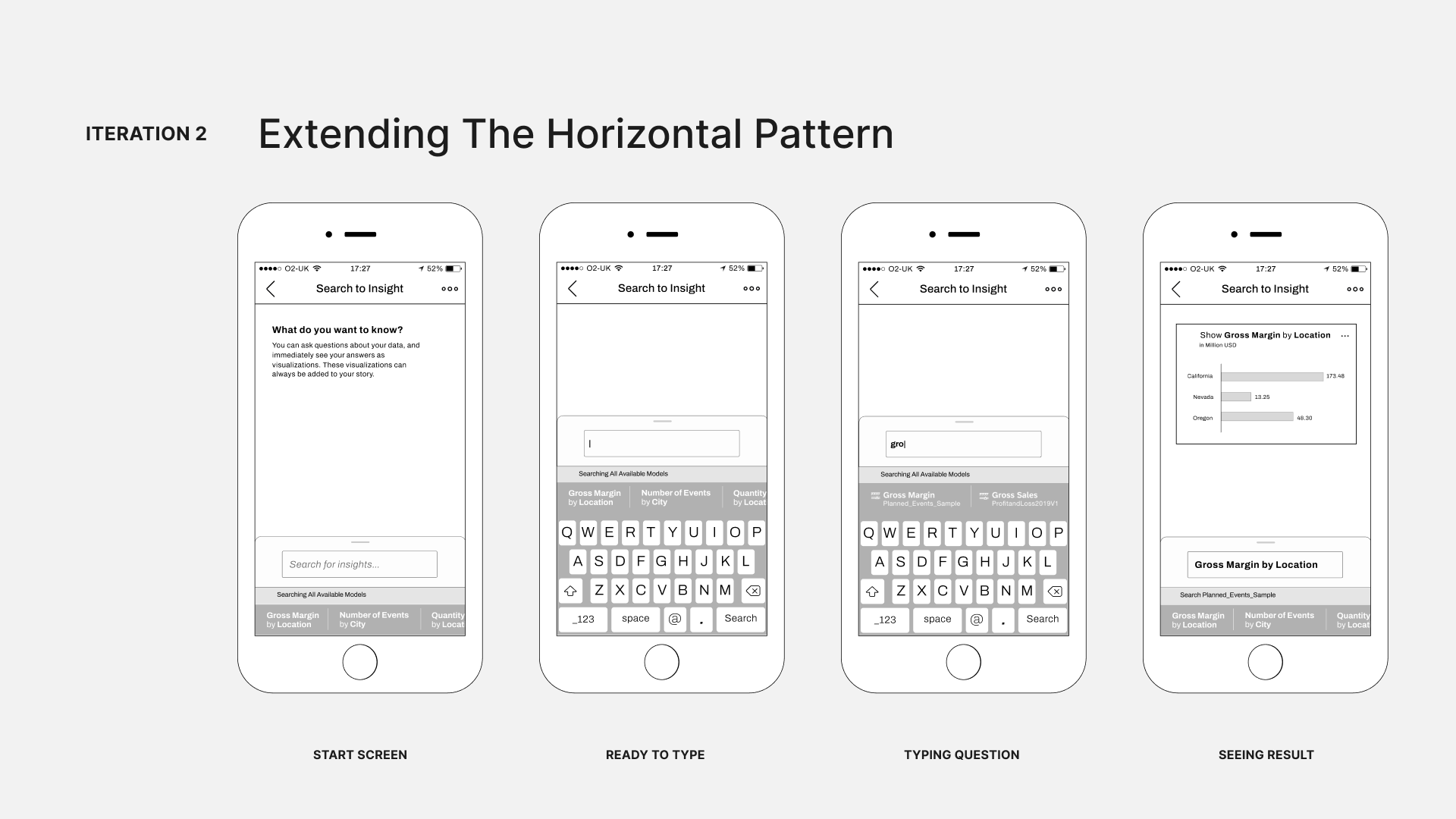
2nd Iteration
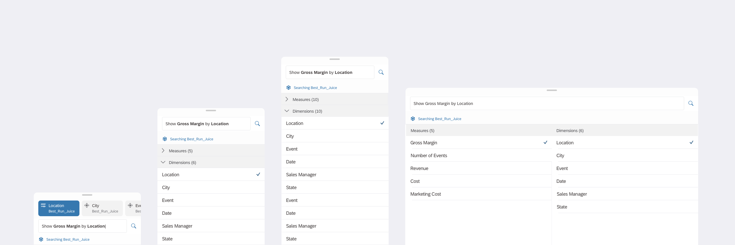
I kept the horizontal pattern and extended it throughout the user flow, including the recommendations. Now, you can see the recommendations at the bottom of the start screen and the same on the results screen, where the data model is set. But testing showed us that it’s not a helpful pattern.
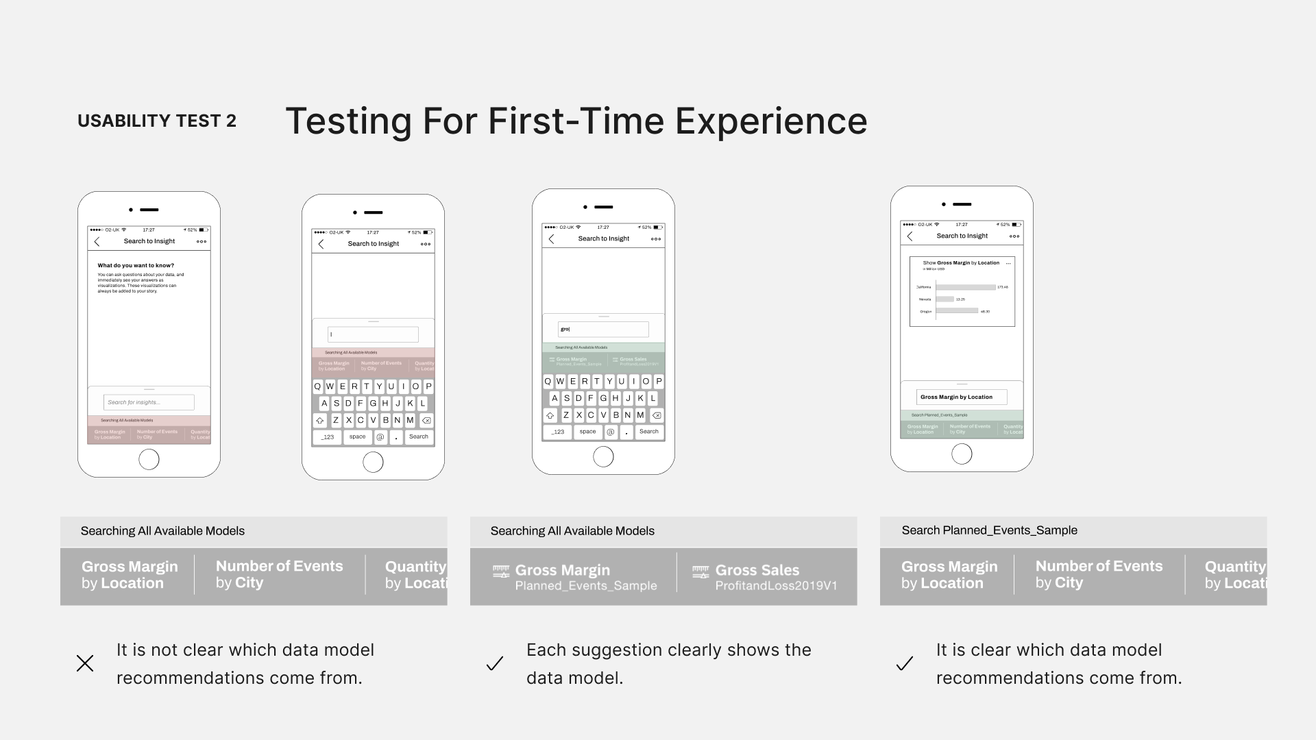
Usability Test 2
Users were mainly confused because our recommendations and suggestions were different. Recommendations were complete questions, while suggestions were specific keywords from various data models. Adding to the confusion, recommendations could come from any data model, and there was no indication of their source.
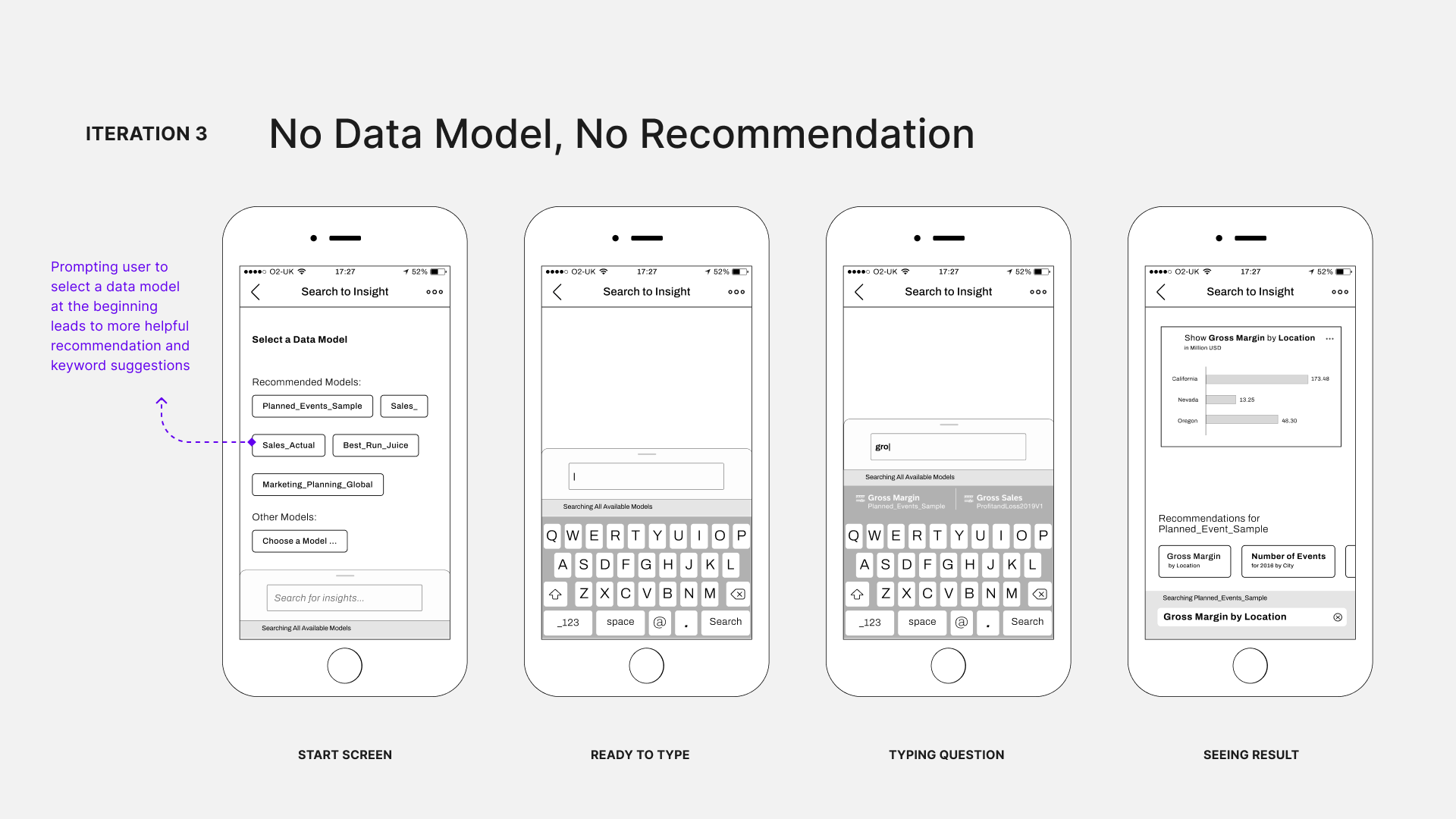
3rd Iteration
To resolve this, in the third iteration, I decided not to show any recommendations unless a data model is selected first. Now, we prompt users to choose a data model, and if they don't, we just show the recommendations after the search results.
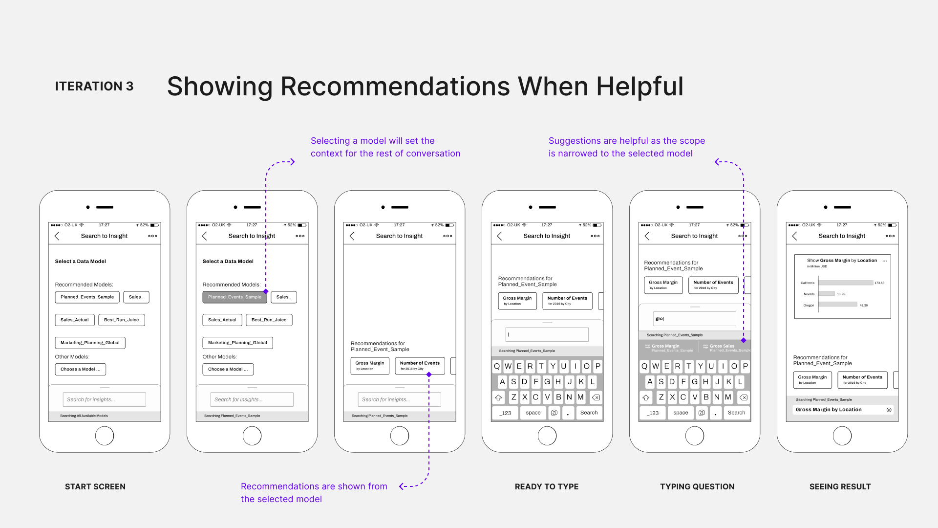
Once a model is selected, we show specific recommendations based on that model. Users can choose from these tailored recommendations and suggestions are specific to the model they selected. I want to mention that “asking a question” is just one of many user flows for this project.
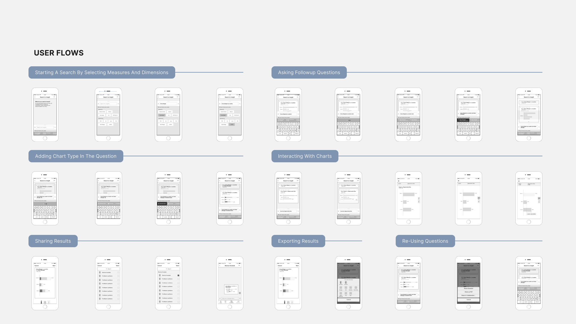
I also had to design others like starting a search by selecting measure and dimension, asking follow-up questions, adding and interacting with charts, sharing results, reusing questions, and exporting results. All these flows went through a similar iterative design process to ensure they were optimized for our decision maker persona and fit well within the mobile environment.
Doing the wire framing at this stage unblocked the development. The team knew the key user flows and necessary user interactions, so they began working on the backend and infrastructure for the user experience.
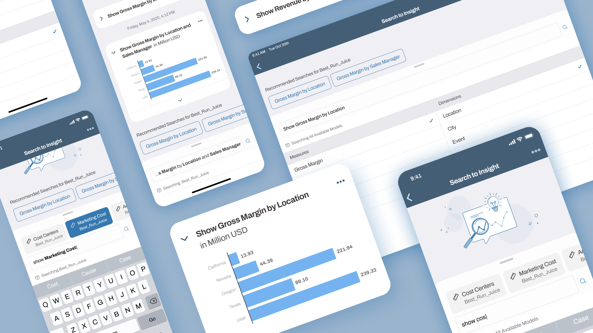
I then moved to high-fidelity design, adapting the Fiori design system, specifically a version tailored for SAP Analytics Cloud.
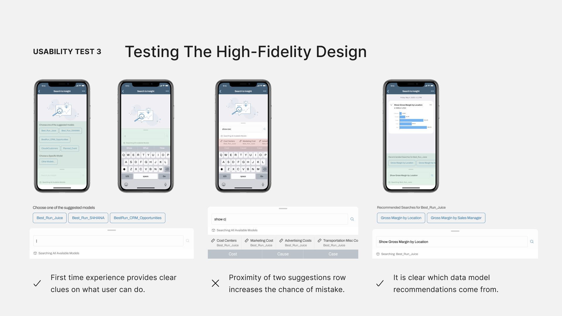
Usability Test 3
After moving to higher fidelity, I did another round of usability testing, and everything went well. The first-time experience gave users clear instructions, and the recommendations were very helpful. However, one issue was that the suggestions at the bottom of the text input box clashed with iOS keyword suggestions and increased the chance of mistakes.
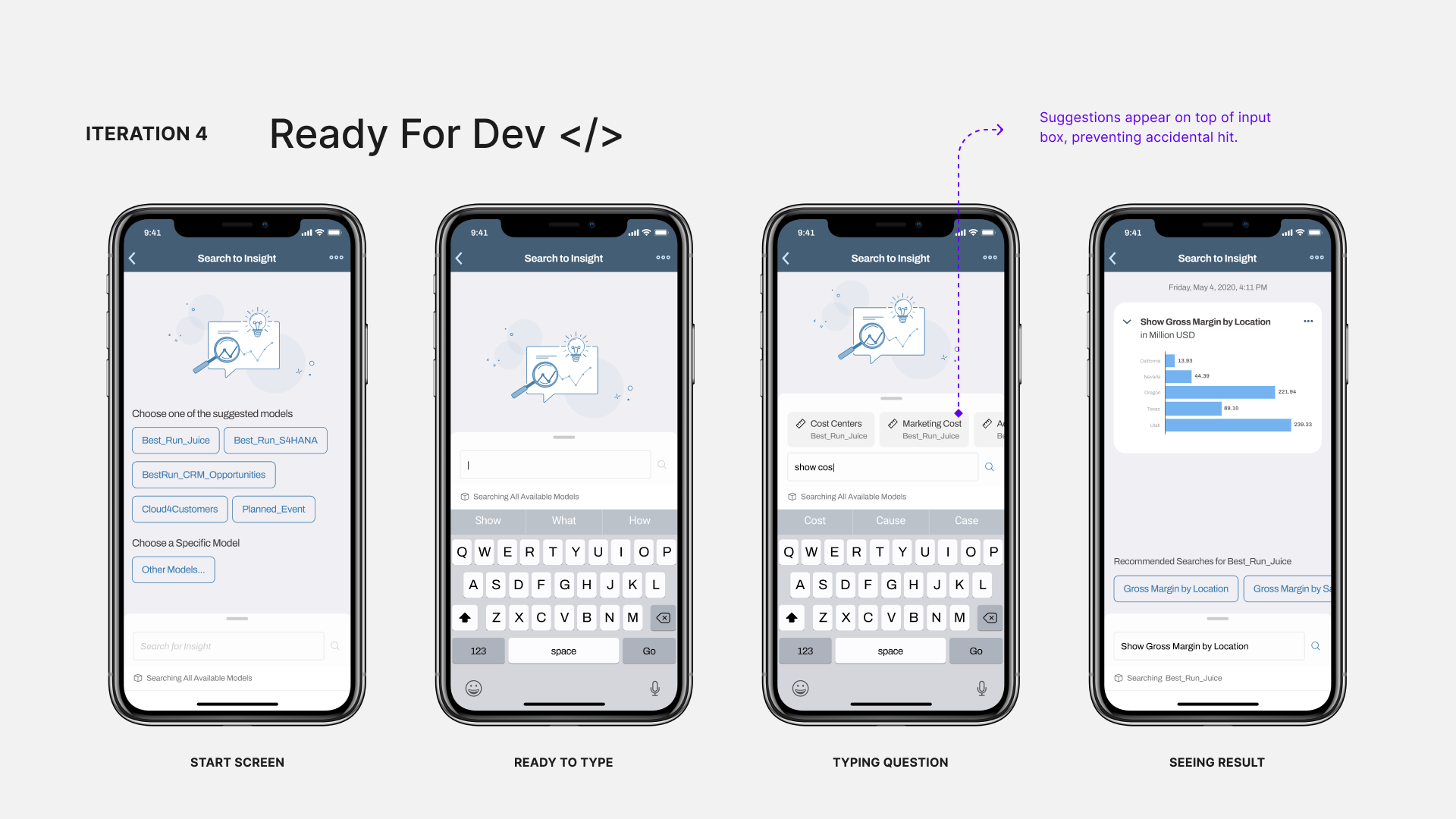
Final Iteration
In the final design, I changed the pattern and moved it above the search box. This was the final iteration, ready for development. Before I wrap up, I want to show how the design evolved for two key screens.
Iterations
For keyword suggestions, the design went from a list to a horizontal carousel to make it easier to use and to avoid accidental taps.
Iterations
The start screen evolved from unhelpful recommendations to prompting users to select their data model, enhancing their experience.
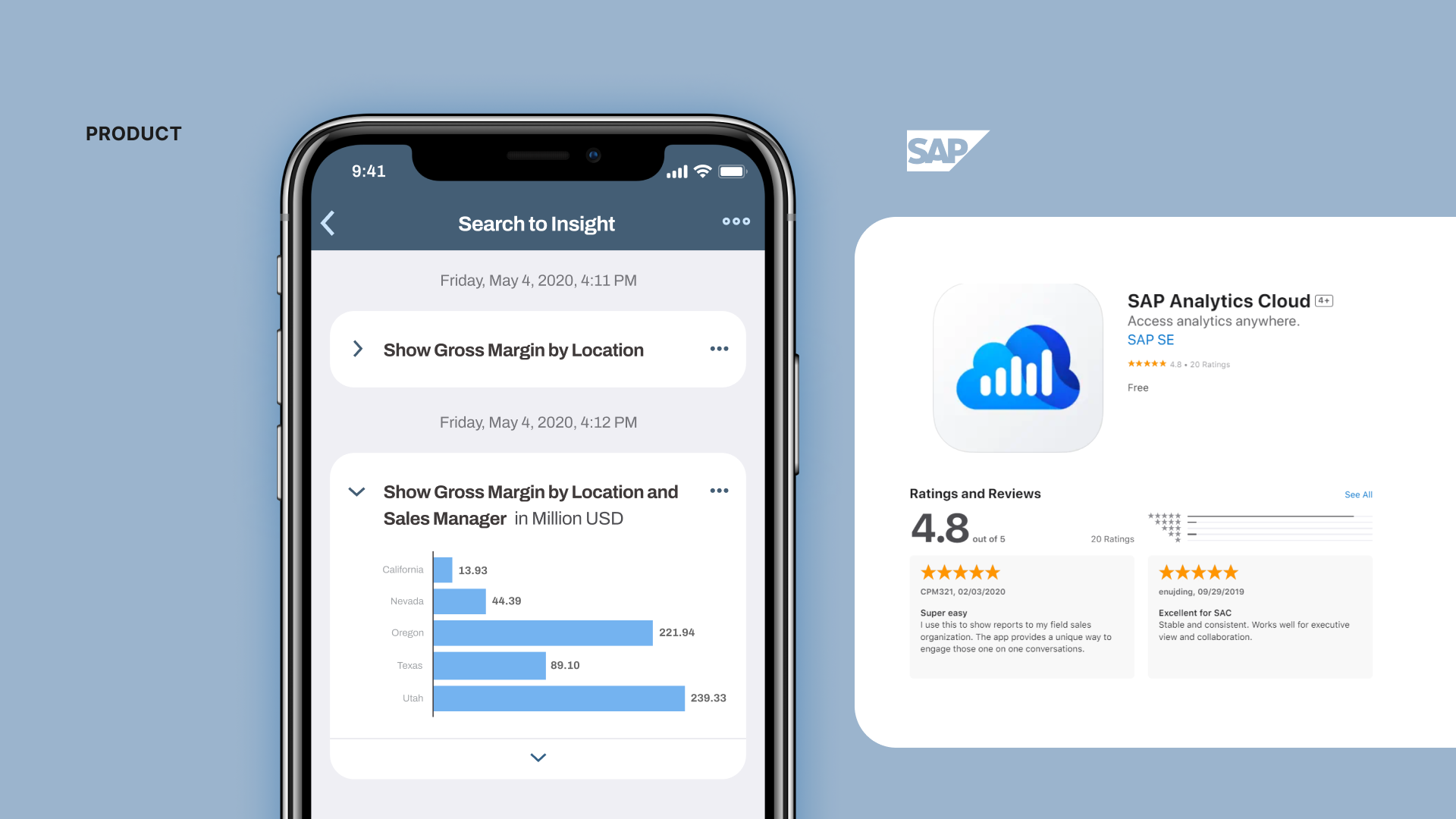
The final product was built, shipped to the app store, and received positive feedback and ratings from users and stakeholders.
Learnings
Collaboration
This project taught me a lot about collaboration with cross-functional teams, which helped in making design decisions and improving the UX for the web app. The pattern I designed for mobile, showing a recommended list of data models, was also adopted by the web app team.
Process
Keeping the design low fidelity sped up and unblocked development sooner. Often, decision makers and stakeholders get fixated on specific visual design details, which shouldn't be the focus during interaction design and layout. By maintaining low fidelity, we avoid one-on-one battles over those details. Once the interaction design is nailed down, we can then move to visual and UI design for higher fidelity. Another benefit, besides efficiency, is that it helps unblock development sooner so they can focus on building the infrastructure.
Design
On the design side, balancing consistency across multiple platforms is valuable so users find the feature intuitive no matter which device they use. But, we also need to optimize the feature for each specific platform so it feels natural in its native environment. Balancing these two aspects was something I practiced throughout this project and was a key learning for me.
Thanks for checking out this case study. Time for another?
UX Transformation for a Data Integration Platform
I led a transformative design journey that elevated the user experience through a cross-platform Design System and Human Interface Guideline.
Transforming Smart Home Interactions at Samsung
I co-invented a novel user interaction aimed at enhancing user safety when interacting with smart devices.
LinkedIn Blueprint
Leveraging LinkedIn’s networking strength to support blue-collar workers transition into knowledge industries.